 |
Amplify Studio is a visual interface that simplifies front- and backend development for web and mobile applications. We released it as a preview during AWS re:Invent 2021, and today, I’m happy to announce that it is now generally available (GA). A key feature of Amplify Studio is integration with Figma, helping designers and front-end developers to work collaboratively on design and development tasks. To stay in sync as designs change, developers simply pull the new component designs from Figma into their application in Amplify Studio. The GA version of Amplify Studio also includes some new features such as support for UI event handlers, component theming, and improvements in how you can extend and customize generated components from code.
You may be familiar with AWS Amplify, a set of tools and features to help developers get started faster with configuring various AWS services to support their backend use cases such as user authentication, real-time data, AI/ML, and file storage. Amplify Studio extends this ease of configuration to front-end developers, who can use it to work with prebuilt and custom rich user interface (UI) components for those applications. Backend developers can also make use of Amplify Studio to continue development and configuration of the application’s backend services.
Amplify Studio’s point-and-click visual environment enables front-end developers to quickly and easily compose user interfaces from a library of prebuilt and custom UI components. Components are themeable, enabling you to override Amplify Studio‘s default themes to customize components according to your own or your company’s style guides. Components can also be bound to backend services with no cloud or AWS expertise.
Support for developing the front- and backend tiers of an application isn’t all that’s available. From within Amplify Studio, developers can also take advantage of AWS Amplify Hosting services, Amplify‘s fully managed CI/CD and hosting service for scalable web apps. This service offers a zero-configuration way to deploy the application by simply connecting a Git repository with a built-in continuous integration and deployment workflow. Deployment artifacts can be exported to tools such as the AWS Cloud Development Kit (AWS CDK), making it easy to add support for other AWS services unavailable directly within Amplify Studio. In fact, all of the artifacts that are created in Amplify Studio can be exported as code for you to edit in the IDE of your choice.
You can read all about the original preview, and walk through an example of using Amplify Studio and Figma together, in this blog post published during re:Invent.
UI Event Handlers
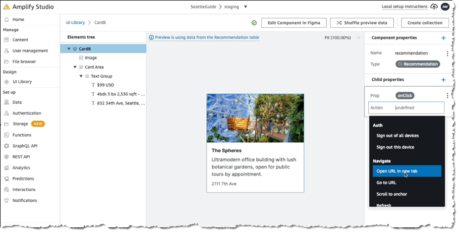
Front-end developers are likely familiar with the concepts behind binding events on UI components to invoke some action. For example, selecting a button might cause a transition to another screen or populate some other field with data, potentially supplied from a backend service. In the following screenshot, we’re configuring an event handler for the onClick event on a Card component to open a new browser tab:
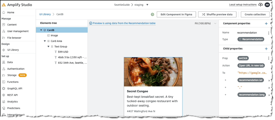
For the selected action we then define the settings, in this case to open a map view onto the location using the latitude and longitude in the card object’s model:
Extending Components with Code
When you pull your component designs from Figma into your project in Amplify Studio using the amplify pull command, generated JSX code and TypeScript definition files that map to the Figma designs are added to your project. While you could then edit the generated code, the next time you run the pull command, your changes would be overwritten.
Instead of requiring you to edit the generated code, Amplify Studio exposes mechanisms that enable you to extend the generated code to achieve the changes you need without risking losing those changes if the component code files get regenerated. While this was possible in the original preview, the GA version of Amplify Studio makes this process much simpler and more convenient. There are four ways to change generated components within Amplify Studio:
- Modifying default properties
Modifying the default properties of components is simple and an approach that’s probably familiar to most developers. These default properties stem from the Amplify UI Library. For example, let’s say we have a custom collection component that derives from the baseCollectiontype, and we want to control how (or even if) the items in the collection wrap when rendered. The Collection type exposes a wrap property which we can make use of: - Override child UI elements
Going beyond individual exposed properties, the code that’s generated for components (and all child components) exposes anoverridesprop. This prop enables you to supply an object containing multiple prop overrides, giving you full control over extending that generated code. In the following example, I’m changing the color prop belonging to the Title prop of my collection’s items to orange. As I mentioned, the settings object I’m using could contain other properties I want to override too: - Extending collection items with data
A useful feature when working with items in a collection is to augment items with additional data, and you can do this with theoverrideItemsprop. You supply a function to this property, accepting parameters for the item and the item’s index in the collection. The output from the function is a set of override props to apply to that item. In the following example, I’m toggling the background color for a collection item depending on whether the item’s index is odd or even. Note that I’m also able to attach code to the item, in this case, anonClickhandler that reports the ID of the item that was clicked:({ backgroundColor: index % 2 === 0 ? 'white' : 'lightgray', onClick: () = alert(`You clicked item with id: ${item.id}`) })} /> - Custom business logic for events
Sometimes you want to run custom business logic in response to higher-level, logical events. An example would be code to run when an object is created, updated, or deleted in a datastore. This extensibility option provides that ability. In your code, you attach a listener to Amplify Hub’suichannel. In your listener, you inspect the received events and take action on those of interest. You identify the events using names, which have a specific format,actions:[category]:[action_name]:[status]. You can find a list of all action event names in the documentation. In the following example, I’m attaching a listener in which I want to run some custom code when a new item in a DataStore has completed creation. In my code I need to inspect, in my listener, for an event with the nameactions:datastore:create:finished:import { Hub } from 'aws-amplify' … Hub.listen("ui", (capsule) => { if (capsule.payload.event === "actions:datastore:create:finished"){ // An object has been created, do something in response } });
Component Theming
To accompany the GA release of Amplify Studio, we’ve also released a Figma plugin that allows you to match UI components to your company’s brand and style. To enable it, simply install the Theme Editor plugin from the Figma community link. For example, let’s say I wanted to match Amazon’s brand colors. All I’d have to do is configure the primary color to the Amazon orange (#ff9900) color, and then all components will automatically reflect that primary color. The Theming documentation provides the full set of design tokens that you can modify with the Theme Editor.
Get Started with AWS Amplify Studio Today
Visit the AWS Amplify Studio homepage to discover more features, whether you’re a backend or front-end developer, or both! It’s free to get started and designed to help simplify not only the configuration of backend services supporting your application but also the development of your application’s front end and the connections to those backend services. If you’re new to Amplify Studio, you’ll find a tutorial on developing a React-based UI and information on connecting your application to designs in Figma in the documentation.